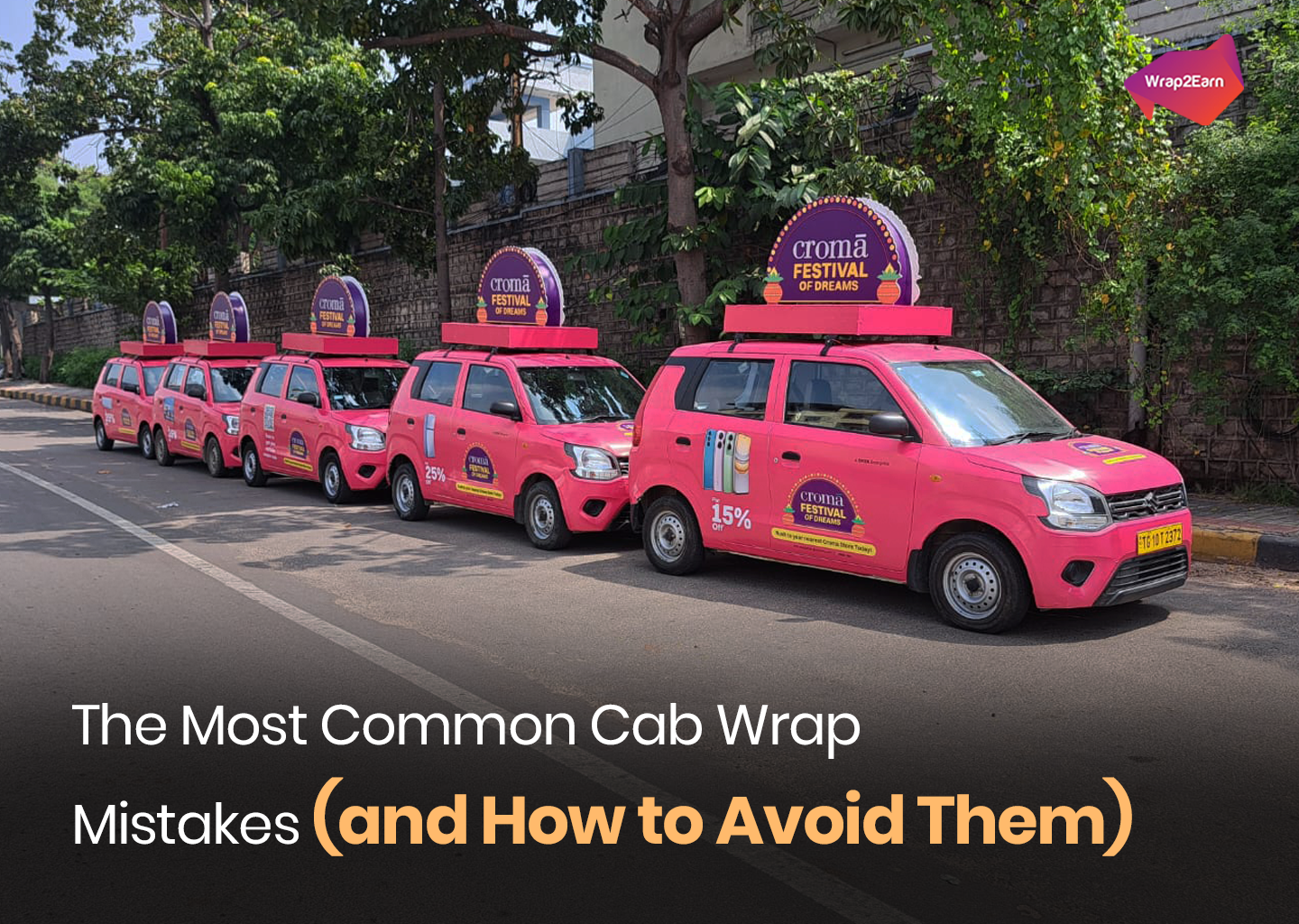
Top 3 Mistakes Brands Make on Cab Wraps (and How to Avoid Them)
Cab wrap campaigns often lose impact due to cluttered designs, poor placement choices, and weak route strategies. Understanding these mistakes helps brands create cleaner, more visible, and more effective transit advertising that performs on the road.

Table of Contents
- Introduction
- Mistake 1: Overloading the Design With Too Much Information
- Mistake 2: Ignoring Real-World-Visibility-and-Placement
- Mistake 3: Underestimating Frequency and Route Strategy
- Conclusion
Introduction
In the fast-moving world of transit advertising, brands get just a few seconds to make an impression. Whether it’s cab branding, auto advertising, or bus ads, the goal is simple: be seen, be remembered, and drive action. But many brands unintentionally reduce the impact of their campaigns by making avoidable mistakes—especially when it comes to cab ads and advertisement on taxi formats that rely on clarity, visibility, and simplicity.
Cab wraps are one of the most effective formats in transport advertising. They allow brands to travel through high-density routes, stay visible in traffic, and reach consumers repeatedly throughout the day. But even the smartest campaigns can fall flat if the fundamentals are overlooked.
Below are the top three mistakes brands make in cab-wrap campaigns—and how to avoid them to maximise recall and ROI.
Mistake 1: Overloading the Design With Too Much Information
One of the biggest mistakes brands make is trying to fit everything into a single wrap: product image, tagline, website, phone number, offer, QR code, social handles, and sometimes even multiple CTAs. In taxi service advertisement formats where your message is constantly moving, this creates clutter and confusion.
Why it hurts your campaign:
- Commuters have just 2–4 seconds to absorb your message.
- A busy design reduces visual hierarchy and weakens brand recall.
- Tiny text becomes unreadable from a distance.
How to fix it:
- Prioritise one core message or offer.
- Use large, bold visuals with high contrast.
- Keep text minimal—one CTA is enough.
- Let your brand elements breathe; white space is your friend.
A clean, focused creative outperforms a detailed one every time in transit ads, especially when your canvas is moving across city streets. For a deeper breakdown of what an effective cab wrap should look like, check out our guide: How to Design a Cab Wrap That Actually Turns Heads.
Mistake 2: Ignoring Real-World Visibility and Placement
What looks stunning on a designer’s screen may not work on a moving vehicle. A common mistake in cab advertising is placing key elements—like CTAs or brand names—on surfaces that curve, bend, or get partially obstructed.
This issue is even more common in bus advertisements, where window channels, door gaps, and panel edges may distort important visuals. Many brands also forget that sunlight, reflection, dust, and weather can impact clarity on the road.
Why it hurts your campaign:
- Key information becomes unreadable from typical viewing angles.
- Designs get cropped unintentionally by vehicle contours.
- Visuals lose contrast outdoors.
How to fix it:
- Map every element to the actual 3D vehicle template—not just the flat design.
- Place CTAs and brand names on the flattest, most visible areas.
- Test visibility from 5–10 metres away.
- Choose colours that maintain contrast under harsh daylight.
Great transport advertising works because it understands the realities of the road—not just the rules of design.
Mistake 3: Underestimating Frequency and Route Strategy
Many brands invest in strong creative but overlook distribution. A single wrapped cab may look great, but it won’t deliver meaningful reach. Similarly, deploying cars on low-traffic routes weakens impact even if the design is perfect.
Why it hurts your campaign:
- Inconsistent impressions reduce recall.
- Under-optimised routes limit visibility in target neighbourhoods.
- Ads don’t generate enough frequency to influence behaviour.
How to fix it:
- Deploy a minimum fleet size that ensures repeated visibility.
- Choose ride-hailing or fleet partners with strong city-wide presence.
- Map campaigns to routes your audience travels daily.
- For maximum amplification, combine cab branding with bus ads for multilevel visibility across roads.
A strong creative message is only half the battle—smart placement completes it. To dive deeper into how route planning impacts campaign performance, check out our blog: What Cab Routes Reveal About Your Audience—and How Brands Can Use It.
Conclusion
Cab wraps remain one of the most cost-effective and high-impact formats in transit advertising today. Whether you're running cab ads, accelerating awareness through advertisement on taxi formats, or extending reach with bus advertisements, avoiding these common mistakes can significantly boost campaign performance.
Keep it simple, keep it visible, and deploy strategically. When done right, taxi advertising doesn’t just get noticed—it gets remembered.
If you want help designing or optimising your next transport advertising campaign, Wrap2Earn can help you build a fleet strategy that delivers impact, consistency, and measurable results across the city.